## get data
symb <- c('BTC-CAD')
date_st <- '2020-05-01'
date_end <- '2023-04-22'
## using auto.assign = FALSE and setting object name to avoid issues with default 'BTC-CAD' name
BTC_CAD <- getSymbols(Symbols=symb, from=date_st, to=date_end, auto.assign = FALSE)Crypto Currency (BTC) PRices: Any Tradeable Daily Patterns?
R
analysis
crpto-currency
Intro
I’ve come across discussion on day-of-week patterns in Bitcoin in various circles, with the most common suggestion being that Bitcoin tends to be higher during the weekdays than on weekend days. Just because somebody says so, doesn’t make it so today, even if it may have been true in the past.
So do any patterns really exist? And, more importantly: if they do exist, are there profitable trades to be made on a reliable basis?
tl;dr
Surprise…No. At least as far as I can tell. ;)
Read on for the details! Of course, there may be flaws, errors, or ommissions in my analysis. Use at your own risk - this is merely for infotainment purposes and is not at all intended as any sort of financial or trading advice. :)
Get Data
Focus on recent years, due to long-term volatility and evolution of the market focus.
Looking at Bitcoin as the apex crypto currency. Other coins may have entirely different patterns.
Using BTC-CAD because…well, I’m Canadian and I trade in Canadian $.
Initial Look at Data
dygraph(BTC_CAD[,"BTC-CAD.Close"])Focus on Recent Trading Range
- recent history is likely to be more representative of future results (?)
- somewhat arbitrary - picking a point that seems to represent current ranges
rec <- '2022-06-18/'
btc_rec <- BTC_CAD[rec]
dygraph(btc_rec[,"BTC-CAD.Close"])
Add Days of Week
- Add weekdays to identify and compare prices by day of week.
- Add date of each week to identify and compare weeks.
Easiest - for me, at least - to convert time series to data frame:
btc_rec_df <- data.frame(btc_rec)
btc_rec_df$date <- index(btc_rec)
## add days
btc_rec_df$day <- weekdays(index(btc_rec), abbreviate = TRUE)
## - set days to factors
btc_rec_df$day <- factor(btc_rec_df$day)
btc_rec_df$day <- fct_relevel(btc_rec_df$day, c("Sun","Mon","Tue","Wed","Thu","Fri","Sat"))
## add weeks
btc_rec_df$week_of <- floor_date(btc_rec_df$date, unit='weeks')
View the structure of the data with additional components added:
'data.frame':   309 obs. of  9 variables:
 $ BTC.CAD.Open    : num  26671 24766 26725 26737 26796 ...
 $ BTC.CAD.High    : num  27013 26928 27167 27933 26976 ...
 $ BTC.CAD.Low     : num  23069 23536 25645 26429 25699 ...
 $ BTC.CAD.Close   : num  24774 26725 26743 26785 25910 ...
 $ BTC.CAD.Volume  : num  54725903315 45938111198 40010094692 37466596738 37043219273 ...
 $ BTC.CAD.Adjusted: num  24774 26725 26743 26785 25910 ...
 $ date            : Date, format: "2022-06-18" "2022-06-19" ...
 $ day             : Factor w/ 7 levels "Sun","Mon","Tue",..: 7 1 2 3 4 5 6 7 1 2 ...
 $ week_of         : Date, format: "2022-06-12" "2022-06-19" ...
Comparative views
Take a look at daily comparisons for this period:
btc_rec_df %>% ggplot(aes(x=day, y=BTC.CAD.Close))+geom_boxplot(fill=fill_color)+
  scale_y_continuous(labels=dollar_format())+
  labs(title="Distrib. of BTC-CAD Closing Price by Day", y='BTC-CAD Close', x="")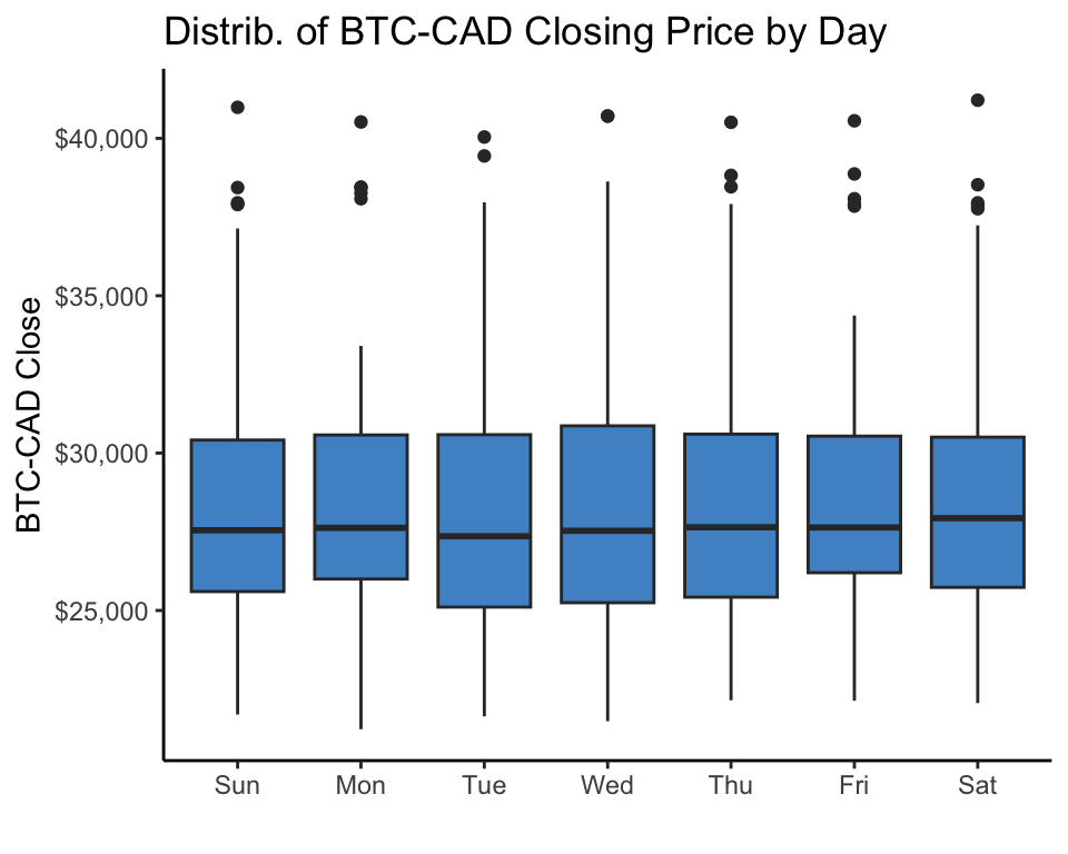
No strong, obvious pattern over the period.
- Maybe Tue-Sat?
This data is over a period where there is a lot of variance in the price that may blur the daily patterns. Could still be that there is a consistent pattern within weeks.
For more granularity, let’s look at week-by-week trends by day:
week_plot <- btc_rec_df %>% ggplot(aes(x=day, y=BTC.CAD.Close, color=as.factor(week_of), group=week_of))+geom_line()+
  scale_y_continuous(labels=dollar_format())+
  scale_x_discrete(expand=c(0,0))+
  labs(title="BTC-CAD Closing Price by Day by Week",x="",y="BTC-CAD Close")+
  theme(legend.position = 'none')
ggplotly(week_plot)
Some weeks with upward trend through the week, others declining or flat: not exactly a consistent pattern to rely on across this date range.
Specific Day of Weeks Comparisons
Look at some individual day of week comparisons
Tue - Sat
Slope chart
day_01 <- 'Tue'
day_02 <- 'Sat'
btc_rec_d_df <- btc_rec_df %>% filter(day==day_01 | day==day_02)
dd_plot <- btc_rec_d_df %>% ggplot(aes(x=day, y=BTC.CAD.Close, color=as.factor(week_of), group=week_of))+geom_line()+
  scale_y_continuous(labels=dollar_format())+
  scale_x_discrete(expand=c(0,0))+
  labs(title="BTC-CAD Price by Day",x="",y="BTC-CAD Close")+
  theme(legend.position = 'none')
ggplotly(dd_plot)
Pretty hard to pick out any obvious/consistent pattern. Let’s take a closer look:
- get each week % change for these days.
- get summary stats on these changes.
- look at distribution of % change to see if any consistency.
Histogram
## may need to remove first row if starts with the day later in the week
btc_rec_d_df <- btc_rec_d_df[-1,]

## may need to remove last row, if ends on day earlier in the week
#btc_rec_d_df <- btc_rec_d_df[-nrow(btc_rec_d_df),]
## calc % chg
btc_rec_d_df <- btc_rec_d_df %>% mutate(
  wk_chg=BTC.CAD.Close/lag(BTC.CAD.Close)-1
)
## calculate some stats and make them pretty for printing
mwkchg_calc <- median(btc_rec_d_df$wk_chg, na.rm=TRUE)
mwkchg <- glue(prettyNum(mwkchg_calc*100, digits=2),"%")
awkchg_calc <- mean(btc_rec_d_df$wk_chg, na.rm=TRUE)
awkchg <- glue(prettyNum(awkchg_calc*100, digits=2),"%")
wkchg_pctl <- quantile(btc_rec_d_df$wk_chg, 0.5, na.rm=TRUE)
## set color for mean based on above/below zero
acolor <- ifelse(awkchg_calc>0,'green','red')
apos <- ifelse(awkchg_calc>0,0.05,-0.05)
mpos <- ifelse(mwkchg_calc>0,0.05,-0.05)
## histogram
btc_rec_d_df %>% ggplot(aes(x=wk_chg))+geom_histogram(fill=fill_color)+
  scale_y_continuous(expand = c(0,0))+
  geom_vline(xintercept=mwkchg_calc, color='black', linetype='dashed', size=1)+
  geom_vline(xintercept=awkchg_calc, color=acolor, linetype='dashed', size=1)+
  annotate(geom='text', label=paste0("median: ",mwkchg), x=mwkchg_calc+mpos, y=10, color='black')+
  annotate(geom='text', label=paste0("ave: ",awkchg), x=awkchg_calc+apos, y=12, color=acolor)+
  labs(title=paste0("Distribution of Weekly Returns from ",day_01," to ",  day_02), y="")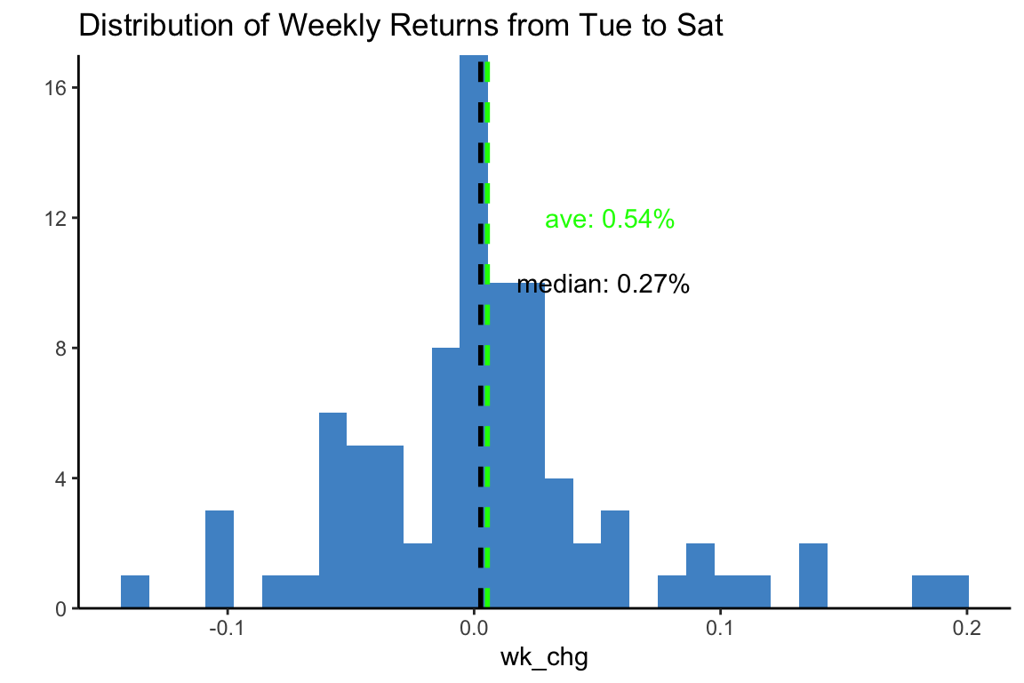
Basically a wash:
- median of 0.27% tells us there is 50% chance of being either above or below 0.27% return on the week, with pretty even distribution on each side. Being very close to 0, doesn’t give us much hope.
- Ave. return on the week (0.54%) holds some potential promise but not particularly inspiring.
Side-by-Side Boxplot
## check boxplot
btc_rec_d_df %>% ggplot(aes(x=day, y=BTC.CAD.Close))+geom_boxplot(fill=fill_color)+
  labs("Compare Price by Day", x="")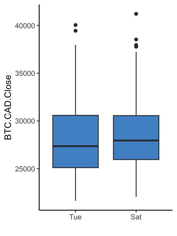
Similar conclusion to previous: looks like there might be some difference, not conclusive.
Issues
Two potential (major) issues:
- Transaction fees, spread, etc. will likely erase this small gains - at least at the level many of us operate.
- The gains may not be statistically significant enough to rely on.
We can assume that issue #1 is a deal-breaker, but we can dig deeper on issue #2 for fun.
Hypothesis Test
For this we can use paired sample t-test. This is used to compare ‘before / after’ situations within the same samples.
Requirements
For paired t-test to be valid, we need the following:
- Calculate difference for each sample.
- Normally distributed data: check for normal distribution of differences.
- Run t-test with paired = TRUE.
- differences have already been calculated.
- normality check: can be eye-balled in histogram above. For extra measure, check QQ plot and Shapiro-Wilk test. (Not really needed, since well over 30 samples, but what the heck)
QQ Test
## check normality
qqnorm(btc_rec_d_df$wk_chg) ## qqplot
qqline(btc_rec_d_df$wk_chg) ## shows line of perfect normal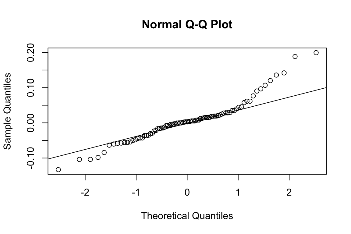
QQ plot looks solid in the mid-range, but data points drift off at the extremes (ideally dots should be right along the line).
Shapiro test
shapiro.test(btc_rec_d_df$wk_chg) ## Shapiro-Wilk test for normality
    Shapiro-Wilk normality test

data:  btc_rec_d_df$wk_chg
W = 0.9, p-value = 0.0003
Low p-value indicates that the data is NOT normally distributed. So that limits the reliability of a paired t-test.
Nevertheless…we’ve come this far, might as well check on statistical significance of the differences in prices between the days.
Paired t-test
Paired t.test to see if the differences in prices from one day to the other are statistically significant, in that they differ from what would be seen with a random collection of prices:
t.test(data=btc_rec_d_df, BTC.CAD.Close ~ day, paired = TRUE)
    Paired t-test

data:  BTC.CAD.Close by day
t = -1, df = 43, p-value = 0.2
alternative hypothesis: true difference in means is not equal to 0
95 percent confidence interval:
 -870  216
sample estimates:
mean of the differences
                   -327
Looks like we do not have statistical significance at all:
- high p-value
- wide confidence interval straddling 0`
So if this info was to be used for investment advice - which it definitely is not - the advice would be: do not try this at home. ;(