We use cookies and other tracking technologies to improve your browsing experience on our website, to show you personalized content and targeted ads, to analyze our website traffic, and to understand where our visitors are coming from.
BC Liquor Sales Analysis: Quarter-of-Year Patterns 2015-2023
(Quarters based on BC LDB fiscal yr Apr-Mar: Q1=Apr, May, Jun. Period is 2015-2023)
BC liquor sales revenue ($) is strongest in Q2 (Jul-Sep of the fiscal yr) and Q3 (Oct-Dec), with generally steep drop-off in Q4 (Jan-Mar) and increase during Q1 (Apr-Jun).
Litre sales have a strong peak in Q2, driven by summer time beer volumes, whereas consumption shifts toward spirts and wine during holiday season.
Intro
This is a continuation of a previous analysis of annual liquor sales in British Columbia, based on data from British Columbia Liquor Distribution Board ‘Liquor Market Review’. The Liquor Market Review is released on a quarterly basis, covering dollar and litre sales across major categories of beer, wine, spirits, and ‘refreshment beverages’ (ciders, coolers).
While the previous analysis compared year-over-year data, the focus here is on patterns in data based on quarter of year, such as typical peaks and valleys throughout the year, including differences by major beverage type.
Data goes back to 2015 (BC LDB Fiscal Year 2016, since fiscal yr ends in March).
As mentioned in previous article:my expertise is in data analysis, not the liquor industry, so the emphasis is on exploring what the data can tell us. Industry-insider context may be lacking. In the interest of promoting data analysis and learning, I am sharing most of the R code used to process the data - hence the expandable ‘Code’ options.
Stats by Quarter of the Year
Overview
We’ll start with an overview across all beverage types and then look at trends for beverage types further down below.
Overlay of $ sales data for quarter of each year to see overall trends:
sales are mostly even in Q2 (Jul-Aug-Sep) and Q3 (Oct-Nov-Dec), covering most of the summer and the Christmas holiday season.
Q4 (Jan-Feb-Mar) by far the slowest period.
Code
ch_title <-"$ Sales Comparison by Quarter (fiscal yr end Mar 31)"plot <- trend_ttl_qtr %>%ggplot(aes(x=qtr, y=netsales, color=factor(fyr), group=fyr))+geom_line()+geom_point()+geom_line(data=trend_qtrs, aes(x=qtr, y=avgsales, group=1), color='black', linewidth=1.5)+scale_y_continuous(labels=label_comma(scale=1e-6, prefix="$", suffix="M"), expand=expansion(add=c(0,0.1)), limits=c(0,max(trend_ttl_qtr$netsales)))+labs(title=ch_title, x="", y="Net $ Sales", color='fiscal yr')ggplotly(plot)
BC LDB fiscal yr end Mar 31, so Q1=Apr-May-Jun, and so on; black line = average.
The drop from Q3 to Q4 is the only consistent pattern across the years looked at. Relative level of sales between Q1-Q2 and Q2-Q3 varies from year to year.
Looking at patterns in % change between quarters confirms that either ends of the fiscal yr have the biggest changes:
Q4 has a consistently large drop from previous quarter and Q1 has consistently big increase from previous quarter.
Q2 tends to show positive growth over Q1, but not always. Q3 straddles 0% change from previous.
Code
ch_title <-"Distribution of % Change in $ Sales Between Quarters"plot <- trend_qtr %>%ggplot(aes(y=pc_chg_sales, x=qtr))+geom_boxplot(fill=bar_col)+scale_y_continuous(labels=percent_format())+geom_hline(yintercept =0, linetype='dotted')+labs(title=ch_title, x="",y="% chg from prev quarter")ggplotly(plot)
The middle black line represents median for each quarter, with the colored area representing the range from 25% of the time to 75% of the time (1st & 3rd quartiles).
Litres
Overlaying litres sold by quarter for each year shows volume changes throughout the year:
Q2 (Jul-Aug-Sep) has highest sales, edging out Q1 (Apr-May-Jun)
Q3 (Oct-Nov-Dec) sees drop, even with holidays, and then lower again for Q4 (Jan-Feb-Mar)
Code
ch_title <-"Litres Comparison by Quarter (fiscal yr end Mar 31)"plot <- trend_ttl_qtr %>%ggplot(aes(x=qtr, y=litres, color=factor(fyr), group=fyr))+geom_line()+geom_point()+geom_line(data=trend_qtrs, aes(x=qtr, y=avglitres, group=1), color='black', size=1.5)+scale_y_continuous(labels=label_comma(scale=1e-6, suffix="M"), expand=expansion(add=c(0,0.1)), limits=c(0,max(trend_ttl_qtr$litres)))+labs(title=ch_title, x="", y="litres", color='fiscal yr')ggplotly(plot)
BC LDB fiscal yr ends Mar 31
The different pattern compared to $ sales likely represents the shift in drinking habits with the seasons:
peak volume (litres) is in Q2 - beer season, and beer, along with refreshment beverages, are consumer in higher volumes than the other types.
Q3, which is usually even with Q2 in $ sales, has a consistent drop in litre volume compared to Q2, due to shift away from beer/refreshments beverages toward wine and spirits.
Patterns by beverage type are looked at more below.
Percentage changes from one quarter to the next reflect the different quarter-by-quarter patterns for litres.
Code
ch_title <-"Distribution of % Change in Litres Between Quarters"plot <- trend_qtr %>%ggplot(aes(y=pc_chg_litres, x=qtr))+geom_boxplot(fill=bar_col)+scale_y_continuous(labels=percent_format())+geom_hline(yintercept =0, linetype='dotted')+labs(title=ch_title, x="",y="% chg from prev quarter")ggplotly(plot)
Q1 (Apr-May-Jun) typically has around 35% increase over previous Q4
Q2 (Jul-Aug-Sep) tends to be even or slight increase over Q1.
Q3 (Oct-Nov-Dec) big drop around 15% range compared to Q2.
Q4 (Jan-Feb-Mar) usually another ~15% from Q3 to Q4.
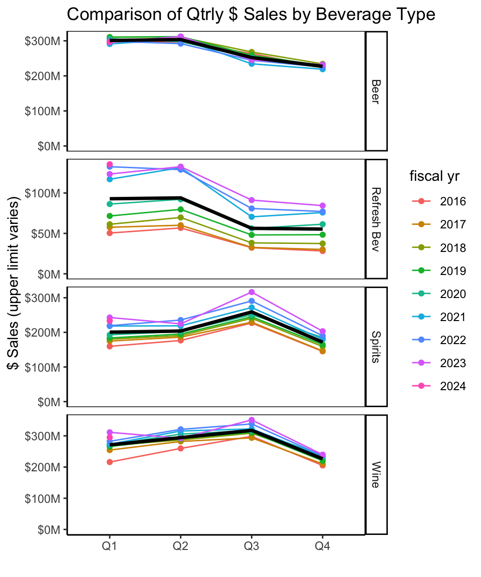
By Major Beverage Type
Let’s look at beverage types to see what is going on below the surface of overall trends.
Stacked chart highlights the shifts between Q2 and Q3:
decline in $ sales of Beer and Refreshment Beverages in Q3 almost completely offset by increase in wine and spirits.
Code
trend_qtrs_cat$type <-fct_reorder(trend_qtrs_cat$type, trend_qtrs_cat$avg_netsales)ch_title <-"$ Sales by Type"plot <- trend_qtrs_cat %>%ggplot(aes(x=qtr, y=avg_netsales, fill=type))+#geom_col(position='fill')+geom_col()+scale_y_continuous(labels=label_comma(scale=1e-6, prefix="$", suffix="M"), expand=expansion(add=c(0,0.1)))+scale_fill_manual(values=type_color)+labs(title=ch_title, x="",y="Avg Net Sales in Qtr (2015-2023)")+theme(axis.ticks.x =element_blank(),axis.title.y=element_text(size=9))p1_plotly <-ggplotly(plot) %>%layout(margin=list(l=110, r=0), showlegend=TRUE,legend=list(x=-1, y=0.6, xanchor='left', yanchor='middle'))ch_title <-"% $ Sales by Type"plot_f <- trend_qtrs_cat %>%ggplot(aes(x=qtr, y=avg_netsales, fill=type))+geom_col(position='fill')+scale_y_continuous(labels=percent_format(), expand=expansion(add=c(0,0)))+scale_fill_manual(values=type_color)+labs(title=ch_title, x="",y="Avg % Net Sales in Qtr (2015-2023)")+theme(axis.ticks.x =element_blank(),axis.title.y=element_text(size=9))p2_plotly <-ggplotly(plot_f) %>%layout(margin=list(l=60, r=0), showlegend=FALSE)# grid.arrange doesn't work with plotly; plotly has subplot, but couldn't get right layoutmanipulateWidget::combineWidgets(p1_plotly, p2_plotly, nrow=1, colsize =c(3,2))
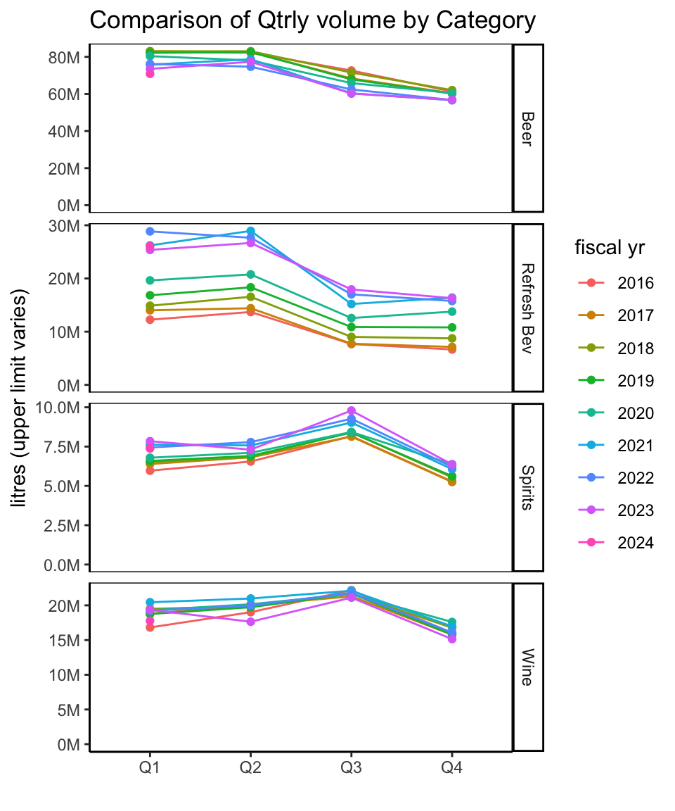
Litres
Similar quarter-over-quarter patterns can be seen when looking at litres sold, although the overall differences from one quarter to the next - especially Q2 to Q3 - are larger when measured in litres, since Beer and Refreshment Beverages are consumed in larger quantities than Wine and Spirits.
Chart on right highlights the bulge in % litre share for Wine in Q3 (Sep-Dec), an increase from 15% in previous quarter to 20% in Q3. Spirts likewise have strong increase from 6% in Q2 to 8% in Q3. These shifts in share come at the expense largely of Refreshment Beverages - dropping from 16% in Q2 to 11% in Q3 - and Beer, to a lesser extent, down only 2%. It seems refreshment beverage drinkers are somewhat fickle and maybe make choices based on the season.
Part 2 Wrap-up and Next Up
This concludes our look at quarter patterns, including quarters from mid-2015 to mid-2023.
Next-up:
Category trends and patterns: closer look at each of the major beverage types, exploring categories and sub-categories within them, as reported in the Liquor Market Review.
Category 1: Beer: start with beer, because…beer. ;)
Footnotes
Notes on ‘net $ sales’:
the report says “Net dollar value is based on the price paid by the customer and excludes any applicable taxes.”
calculating average net dollar value per litre for beverage categories gives unrealistically low numbers compared to retail prices in BC liquor stores. (Beer at average $4/litre? Not even the cheapest beer on the BC Liquor Stores website.)
there is likely additional factors related to BC LDB pricing structure, wholesaling, etc.
best to consider average net dollar value per litre referred to below as relative indicator.