British Columbia Liquor Distribution Board releases its ‘Liquor Market Review’ on a quarterly basis, covering dollar and litre sales across major alcoholic beverage types of beer, wine, spirits, and ‘refreshment beverages’ (ciders, coolers).
This is a combined look using reports going back to 2015, when the current format was started.
Note:my expertise is in data analysis, not the liquor industry, so the emphasis is on exploring what the data can tell us. Industry-insider context may be lacking. In the interest of promoting data analysis, I am sharing most of the R code used to process the data - hence the expandable ‘Code’ options.
Annual Trends: All Beverage Types
(Based on calendar year, using earliest and most recent full year avail.)
$ Sales
Code
# get full years for comparisondrop_yr <-c(2015,2023) ## drop partial yrs for simplicitytrend_yr <- lmr_data %>%filter(year>drop_yr[1] & year<drop_yr[2]) %>%group_by(year) %>%summarize(netsales=sum(netsales),litres=sum(litres))# add % chg YoY, $/ltrend_yr <- trend_yr %>%mutate(pc_chg_sales=netsales/lag(netsales)-1,pc_chg_litres=litres/lag(litres)-1,dollar_per_litre=netsales/litres,pc_chg_d_per_l=dollar_per_litre/lag(dollar_per_litre)-1)
There has been general upward drift in net sales dollars in recent years, rising to $3.7 billion in 2022:
Code
ch_title <-"Net Sales $ Trends - All Types"## assign plot definition to variable for use with plotlyplot <- trend_yr %>%ggplot(aes(x=year, y=netsales, group=1))+geom_line(color=bar_col, linewidth=2)+geom_point(aes(y=netsales), color=bar_col, size=3)+scale_x_continuous(breaks=trend_yr$year)+## ensure each value shown in x-axisscale_y_continuous(labels=comma_format(prefix="$", scale=1e-9,suffix="B"), expand=expansion(mult=c(0,0.1)), limits=c(0,max(trend_yr$netsales)))+labs(title=ch_title,y="",x="")+theme_classic()ggplotly(plot) ## convert to plotly for interactivity
Year-over-Year % Change: ($ Sales)
There is an out-sized year-over-year % increase in 2020, first year of the covid-19 pandemic:, with growth nearing 6%:
Code
# chart % chg sales YoYch_title <-"Net Sales: Year-over-Year % change"# convert year to integer to identify first yr for filtering, since no number for % chgmin_yr <-min(as.integer(as.character(trend_yr$year)))## plot - filtered to exclude first yrplot <- trend_yr %>%filter(year!=min_yr) %>%ggplot(aes(x=year, y=pc_chg_sales))+geom_col(fill=bar_col)+geom_hline(yintercept=mean(trend_yr$pc_chg_sales, na.rm=TRUE), linetype='dotted')+geom_hline(yintercept=median(trend_yr$pc_chg_sales, na.rm=TRUE), linetype='dotted', color='lightblue')+scale_x_continuous(breaks=trend_yr$year)+scale_y_continuous(labels=percent_format(), expand=expansion(mult=c(0,0.1)))+labs(title=ch_title,y="",x="")+theme(axis.ticks.x =element_blank()) ggplotly(plot)
(black line = average, blue line = median)
By far the biggest YoY change was … pandemic time! Prior to 2020, annual increases were slowing down, while total still increasing. In 2022, YoY growth has returned to pre-2020 levels, close to the median (light blue line).
Volume (Litres)
Sales in litres have been essentially flat in recent years, averaging 457 million litres per year:
Litre volume has remained relatively steady, with a peak during the 2020 pandemic at 470 million litres. Volumes are slowing down, although 2022 still above 2019.
Year-over-Year % Change: Volume (Litres)
Biggest year-over-year jump of ~4% in 2020, with declines accelerating from 2021 to 2022.
Code
# chart % chg liters YoYch_title <-"Litre Vol.: Year-over-Year % change"plot <- trend_yr %>%filter(year!=min_yr) %>%## filter first yr (calc above) since no valueggplot(aes(x=as.factor(year), y=pc_chg_litres))+geom_col(fill=bar_col)+geom_hline(yintercept=mean(trend_yr$pc_chg_litres, na.rm=TRUE), linetype='dotted')+scale_y_continuous(labels=percent_format(), expand=expansion(mult=c(0.1,0.1)))+geom_hline(yintercept=0)+labs(title=ch_title,y="",x="")+theme(axis.ticks.x =element_blank()) ggplotly(plot)
After strong growth of 4% in 2020, 2022 saw by far the largest decrease in volume consumption in 6 years, down 2%.
$/Litre
Looking at trends in $/litre provides a proxy for ‘price’ and gives a sense of how overall prices have changed over time. (see footnote for caveats.) No surprise: steadily upward, increasing with inflation:
$/litre has trended up to $8 by 2022. (this may seem unrealistically low - see footnote for caveats and use as directional information.)
Year-over-Year % Change: $/Litre
With relatively flat litre volume sales, the increase in dollar volume is driven by increase in sales $ per litre. Dollar per litre increases have been fairly steady, around 2%, until 2021. This corresponds with overall increase in inflation, accelerating through 2021 and 2022:
$/litre increases look exponential from here, but would be expected to level off as inflation slows down.
Annual Trends: By Beverage Type
As noted, the BC LMR provides a breakdown of sales by four major beverage types: beer, refreshment beverages, spirits, wine.
By Type: $ Sales
Code
# annual data by typedrop_yr <-c(2015,2023) ## drop partial yrs for simplicitytrend_yr_cat <- lmr_data %>%filter(year>drop_yr[1] & year<drop_yr[2]) %>%group_by(year, type) %>%summarize(netsales=sum(as.numeric(netsales)),litres=sum(as.numeric(litres))) trend_yr_cat <- trend_yr_cat %>%ungroup() %>%mutate(dollar_per_litre=netsales/litres,pc_chg_sales=netsales/lag(netsales, n=4)-1, # yoy change by beverage typepc_chg_litre=litres/lag(litres, n=4)-1,pc_chg_dollar_per_l=dollar_per_litre/lag(dollar_per_litre, n=4)-1)## get subset of trend_yr data to add annual totals to trend_yr_cat for % of ttl calculationstrend_yr_yr <- trend_yr %>%select(year, netsales, litres) %>%rename(netsales_ttl=netsales,litres_ttl=litres)trend_yr_cat <-left_join(trend_yr_cat, trend_yr_yr, by='year') %>%mutate(pc_ttl_sales=netsales/netsales_ttl,pc_ttl_litres=litres/litres_ttl)
For $ sales, wine and beer are the largest types (well over 50%), followed by spirits, with refreshment beverages as distant fourth:
Code
# annual sales by type (stack)ch_title <-"Net $ Sales by Type"# order type by netsales for charttrend_yr_cat$type <-fct_reorder(trend_yr_cat$type, trend_yr_cat$netsales)trend_yr_cat$year <-as.factor(trend_yr_cat$year) ## foctar works better for bar chartsplot <- trend_yr_cat %>%ggplot(aes(x=year, y=netsales, fill=type))+geom_col()+scale_y_continuous(labels=label_comma(prefix="$", scale=1e-9,suffix="B"), expand=expansion(mult =c(0,0.1)))+scale_fill_manual(values=type_color)+labs(title=ch_title, x="",y="", fill='')+## setting fill='' removes title from legendtheme(axis.ticks.x =element_blank())ggplotly(plot)
By Type: $ Sales % Breakdown
Looking at the overall % breakdown, we can more easily spot changes in composition over time:
Code
ch_title <-"Net $ Sales by Type, % of Total"plot <- trend_yr_cat %>%ggplot(aes(x=year, y=pc_ttl_sales, fill=type))+geom_col()+## could use same as prev chart with position='fill' but wanted numbers for chartscale_y_continuous(labels=percent_format(), expand=expansion(mult =c(0,0.1)))+scale_fill_manual(values=type_color)+labs(title=ch_title, x="",y="", fill='')+theme(axis.ticks.x =element_blank(),legend.title =element_blank())ggplotly(plot)
Percentage breakdown shows wine and beer with bulk of market share, BUT…beer particularly fading in favour of refreshment beverages and spirits, with the former showing strongest relative growth. Beer has gone from 36% of total $ sales in 2016 to under 30% in 2022, while refreshment beverages have gone from under 6% to close to 12%.
By Type: $ Sales Year-over-Year % Change
Refreshment Beverages had dolllar sales growth of over 20% for 3 years in a row:
Code
ch_title <-"% Chg in Net $ Sales, Year-over-Year by Type"## plot - filtered to exclude lowest yr, calculated aboveplot <- trend_yr_cat %>%filter(year!=min_yr) %>%ggplot(aes(x=year, y=pc_chg_sales))+geom_col(fill=bar_col)+geom_hline(yintercept =0)+facet_grid(.~type)+scale_y_continuous(labels=percent_format())+theme(strip.background =element_rect(fill = bar_col)) +theme(strip.text=element_text(color='white'))+labs(title=ch_title, x="",y="")+theme(axis.text.x=element_text(hjust=0, vjust=0.5, angle=90),axis.ticks.x =element_blank() ,panel.border =element_rect(fill=NA) ) ggplotly(plot)
During the pandemic in 2020, Refreshment Beverages had a surge in growth, on top of an already strong trend from previous years. Spirits also had a significant increase - around 10% year-over-year growth.
Beer is the only beverage type with negative growth during the period, through 2019-2021, although recovered in 2022.
By Type: Volume (Litres)
Looking at litre sales confirms growth of Refreshment Beverages:
Code
# annual litres by category (stack)ch_title <-"Volume (Litres) by Type"# order type by netsales for charttrend_yr_cat$type <-fct_reorder(trend_yr_cat$type, trend_yr_cat$litres)plot <- trend_yr_cat %>%ggplot(aes(x=year, y=litres, fill=type))+geom_col()+scale_y_continuous(labels=label_comma(scale=1e-6,suffix="M"), expand=expansion(mult =c(0,0.1)))+scale_fill_manual(values=type_color)+labs(title=ch_title, x="",y="", fill='')+theme(axis.ticks.x =element_blank())ggplotly(plot)
Beer constitutes the largest volume by far (no surprise), although has been shrinking, with growth in Refreshment Beverage volume. Beer went from 295M litres in 2016 to 268M in 2022, while Refreshment Beverages went from 43M to 86M during the same period.
Percentage breakdown highlights even further the decline in beer share of volume (still well over 50%), mostly due to increase in Refreshment Beverages sales.
Code
# annual litres by type (stack)ch_title <-"Volume (Litres) by Type"# order type by netsales for charttrend_yr_cat$type <-fct_reorder(trend_yr_cat$type, trend_yr_cat$litres)plot <- trend_yr_cat %>%ggplot(aes(x=year, y=pc_ttl_litres, fill=type))+geom_col(position='fill')+scale_y_continuous(labels=percent_format(), expand=expansion(mult =c(0,0.1)))+scale_fill_manual(values=type_color)+labs(title=ch_title, x="",y="", fill="")+theme(axis.ticks.x =element_blank())ggplotly(plot)
Beer has gone from almost 70% to under 60% of volume by type, with Refreshment Beverages taking the share and rising to 19% of total.
By Type: Year-over-Year % Change in $ Sales
Refreshment Beverage growth in litres is lower than growth in dollar sales, but still impressive, peaking at over 30% year-over-year.
Code
ch_title <-"% Chg in Volume (Litres), Year-over-Year by Type"## using prev calc. value for first yr, to remove first yr since no % chg valueplot <- trend_yr_cat %>%filter(year!=min_yr) %>%ggplot(aes(x=year, y=pc_chg_litre))+geom_col(fill=bar_col)+geom_hline(yintercept =0)+facet_grid(.~type)+scale_y_continuous(labels=percent_format())+theme(strip.background =element_rect(fill = bar_col)) +theme(strip.text=element_text(color='white'))+labs(title=ch_title, x="",y="")+theme(axis.text.x=element_text(hjust=0, vjust=0.5, angle=90),axis.ticks.x =element_blank() ,panel.border =element_rect(fill=NA) ) ggplotly(plot)
Beer had declining volume in the most recent 5 years, although may be stabilizing. Other types all had strongest volume growth in 2020 during the pandemic. Refreshment beverages saw decline in growth rate in 2022 after 5 years of strong growth.
Interestingly, Beer was the only beverage type that did not experience growth during the first year of covid-19 pandemic - maybe due to relatively high consumption of beer consumed in bars and restaurants? That could explain why declining growth decreased as pandemic restrictions faded.
By Type: $/Litre
Breaking out $/litre (proxy for price) by beverage type shows that not all increase at the same rate, and even $/litredecreasesare possible.
Wine is an interesting case of decrease in $/litre in 2020 - under 2.5%, but a decrease nevertheless. It’s possible this may have been influenced by the changes to LDB pricing model for hospitality industry in 2020 during the pandemic, which allowed restaurants and pubs to purchase alcohol at wholesale prices.
$/Litre vs Volume and $ Sales
Exploring the relationship between changes in $/Litre (proxy for price) and changes in volume, as well as changes in $/Litre and total $ sales:
Are price changes associated with changes in volume purchases?
Are price changes associated with changes in total $ sales?
Notes on two charts below:
y-axis is adjusted for each beverage type to match the data for that type, so please take that into account.
red dotted lines are the 0 axis, both vertically and horizontally.
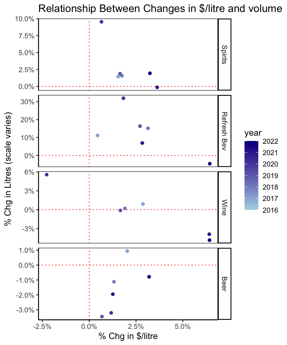
Changes in $/Litre vs Changes in Volume
For changes in $/litre vs volume, in general, we would expect dots to be in the top left (price decrease, volume increase) or bottom right (price increase, volume decrease).
In other words: less is more (and vice versa) - assuming price sensitivity.
Code
ch_title <-"Relationship Between Changes in $/litre and volume"## convert year to numeric for color gradienttrend_yr_cat$year <-as.integer(as.character(trend_yr_cat$year)) trend_yr_cat %>%ggplot(aes(x=pc_chg_dollar_per_l, y=pc_chg_litre, color=year, label=year))+geom_point()+## options for labelling - too cluttered#geom_text(vjust=0.2, hjust=-0.2, size=3)+#geom_text_repel(size=3)+scale_color_gradient(low ="lightblue", high ="darkblue") +facet_grid(type~., scales='free_y')+scale_x_continuous(labels=percent_format())+scale_y_continuous(labels=percent_format())+geom_hline(yintercept=0, linetype='dotted', color='red')+geom_vline(xintercept =0, linetype='dotted', color='red')+labs(title=ch_title, x="% Chg in $/litre", y="% Chg in Litres (scale varies)")+theme(panel.border =element_rect(fill=NA))
Different types of beverages have different relationships between revenue per litre - our proxy for ‘price’ - and volume sales:
Wine is the clearest case in this dataset, where an average price decrease in wine of around 2.5% was associated with ~6% volume growth (top left of Wine panel), price increases around ~1.5%-3% had little apparent effect, and price increases of 6+% were associated with ~3% decline in sales volume.
Beer looks like a counter-intuitive relationship where the smallest price increases actually tended to be associatedwith largest decreases in volume. Depending on the timing, price decreases may have been in response to softening demand, and may have prevented further decreases in volume. In any case, price changes were relatively modest, and there are probably other factors involved.
Refreshment beverages don’t appear to have a consistent relationship between price increase and changes in volume during this period of growth, although most recently a ~6% increase in price is associated with a reversal in the growth trend and a small decrease in volume.
Clearly, though, there are a variety of factors at work here and not enough data to make any solid conclusions with regard to effect of changes in net sales per litre and litre volumes sold.
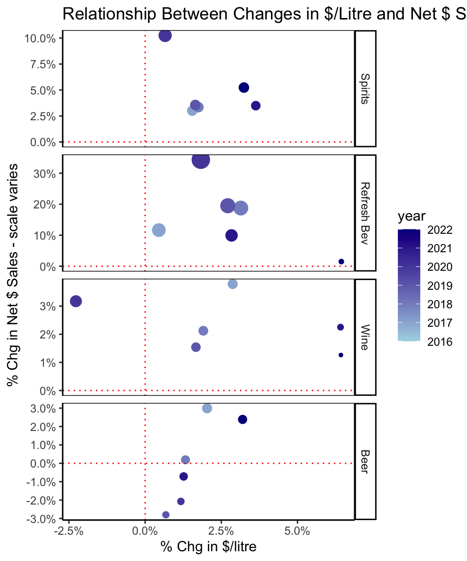
Changes in $/Litre vs Changes in Volume
How does this play out in terms of sales dollars generated along with price and volume changes?
If it plays out well for producers/retailers:
Unit price ($/litre) increases may dampen volume sales but result in growth in overall net $ sales. This outcome would land dots in the top right quadrant.
Likewise, unit price decreases (or smaller increases) will be expected lead to higher volume sales that will more than offset the decrease in unit price and, again, deliver growth in overall net $ sales. Dots would be in the top left.
If it doesn’t play out as hoped by producers/retailers:
Either price increases will dampen demand so much or price decreases will not lift volume sales high enough, and overall net $ sales decreases. This will result in dots in lower right for the former case, or lower left for the latter.
Additional notes on chart below:
As with chart above, y-axis is adjusted for each type, red dotted lines are the 0 axes.
% chg in volume is indicated by size of the dot. This makes for a busy chart but the intention is to highlight the points that represent the biggest (or smallest) changes in % volume as additional reference.
Good news for the industry is that the positive scenarios held up in almost all cases:
Code
ch_title <-"Relationship Between Changes in $/Litre and Net $ Sales"trend_yr_cat %>%ggplot(aes(x=pc_chg_dollar_per_l, y=pc_chg_sales, size=pc_chg_litre, color=year, label=year))+geom_point()+guides(size='none')+scale_color_gradient(low ="lightblue", high ="darkblue") +facet_grid(type~., scales='free_y')+scale_x_continuous(labels=percent_format())+scale_y_continuous(labels=percent_format())+geom_hline(yintercept=0, linetype='dotted', color='red')+geom_vline(xintercept =0, linetype='dotted', color='red')+labs(title=ch_title, x="% Chg in $/litre", y="% Chg in Net $ Sales - scale varies")+theme(panel.border =element_rect(fill=NA))
Beer was the only case where changes in $/litre did not always have the hoped for effect of leading to overall higher total net $ sales: the smaller price changes, associated with declines in volume (small dots), resulted in overall decreasing net $ sales. On the plus side, the largest year-over-year increase in $/litre for beer did result in overall increase in net $ sales, even though associated with decrease in litre volume.
Part 1 Wrap-up & Next-up
That concludes our look at annual trends in the BC Liquor Market Review data.
Next-up:
Quarterly patterns: exploration of the seasonal patterns in the BC liquor market by delving into data at the quarterly level, again going back to 2015.
Category trends and patterns: closer look at each of the major beverage types, exploring categories and sub-categories within them, as reported in the Liquor Market Review.
Coming soon!
Footnotes
Notes on ‘net $ sales’ and ‘$ per litre’:
the report says “Net dollar value is based on the price paid by the customer and excludes any applicable taxes.”
calculating average net dollar value per litre for beverage categories gives unrealistically low numbers compared to retail prices in BC liquor stores. (Beer at average $4/litre? Not even the cheapest beer on the BC Liquor Stores website.)
there is likely additional factors related to BC LDB pricing structure, wholesaling, etc.
best to consider average net dollar value per litre referred to above as relative indicator.