Code
swiss <- swiss
swiss$prov <- rownames(swiss)
swiss_top <- swiss %>% arrange(-Fertility) %>% slice_head(n=10)
# save with relative location for importing to shiny app below -> doesn't help
write_csv(swiss_top, 'data/swiss_top.csv')Taking Quarto docs to the next level by embedding live, fully interactive Shiny apps! An experiment inspired by Joe Cheng’s presentation ‘Running R-Shiny without a Server’ at posit::conf(2023). (20 min video)
Turn out that:
Additional reference:
Note: this project set up using ‘.renv’ which is good for reproducibility, but may cause complications for package management on different machines over time.
R built-in swiss dataset with fertility and socio-economic indicators by province, from 1888.
swiss <- swiss
swiss$prov <- rownames(swiss)
swiss_top <- swiss %>% arrange(-Fertility) %>% slice_head(n=10)
# save with relative location for importing to shiny app below -> doesn't help
write_csv(swiss_top, 'data/swiss_top.csv')Typical static plot produced with ggplot2: useful, but limited:
swiss_top %>% ggplot(aes(x=reorder(prov,Fertility), y=Fertility))+geom_col()+
  geom_hline(yintercept=mean(swiss_top$Fertility), linetype='dashed', color='green')+
  coord_flip()+
  scale_y_continuous(expand=expansion(mult=c(0,0.02)))+
  labs(title='Top 10 Swiss Provinces by Fertility', x="",
       subtitle = '(births per 1,000 women; dotted line = average)')+
  theme_light()+
  theme(axis.ticks.y = element_blank(),
        axis.text.y = element_text(size=11))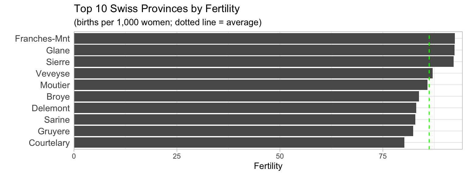
Interactive, filterable version of the chart that leverages R shiny plus webR technology to display in browser…without the need for shiny server!
May take a while to load…
(apologies if the ‘sidebar’ filters are stacked above the chart - appears to be result of narrow width of the theme I’m using and not improved by setting widths of side/main panels; worked as expected in other experiments)
#| standalone: true
#| viewerHeight: 700

# load packages
library(shiny)
library(datasets)
library(tidyverse)
library(scales)
library(here)

# get data - import saved file with relative location
#swiss_top <- read_csv('data/swiss_top.csv') # failed attempt at reading data
swiss <- datasets::swiss
swiss$prov <- rownames(swiss)
swiss <- swiss %>% arrange(-Fertility)

# Define shiny ui
ui <- fluidPage(
  # shiny UI components here
  # Application title
  titlePanel("Swiss Fertility Data by Province"),

  # Sidebar layout with input and output definitions
  sidebarLayout(
    # Sidebar panel for inputs
    sidebarPanel(
      width=3, ## setting worked nicely in other quarto docs - no respond here
      # Input: number of provinces to show (since 47 total)
      numericInput(inputId='num_prov',
                   label='No. of Provs. to show',
                   value=10, min=1, max=50, step=1),
      # Input: checkbox for the regions to plot - dynamic based on num_prov
      uiOutput('dynamicCheckbox'),
      p('note: 47 provinces in total')
      ), # end sidebarPanel

    # Main panel for displaying outputs
    mainPanel(
      width=9,
      h3('Swiss Fertility'),
      # Output: Column chart rendered with ggplot2
      plotOutput(outputId = "fert", height="540px")
    ) # end mainPanel
  )
)

# Define shiny server logic here
server <- function(input, output, session) {
  # shiny server code
  output$dynamicCheckbox <- renderUI({
     num_provinces <- input$num_prov
     checkboxGroupInput(inputId="prov", "Select Provinces (desc order of fertility)",
                        choices = head(swiss$prov, num_provinces),
                        select=swiss$prov)
   })
  # Reactive expression to generate the plot based on the inputs
  output$fert <- renderPlot({
    # filter provinces using checklist and num_prov selector
    swiss_top <- swiss %>% filter(prov %in% input$prov)
    # Generate ggplot2 column chart
    swiss_top |> ggplot(aes(x=reorder(prov, Fertility), y=Fertility))+
      geom_col()+
      geom_hline(yintercept=mean(swiss_top$Fertility),
                 linetype='dashed', color='green')+
      coord_flip()+
      scale_y_continuous(expand=expansion(mult=c(0,0.05)))+
      labs(title='Swiss Provinces by Fertility (1888)',
           subtitle = '(births per 1,000 women; dotted line = average)',
           x="")+
      theme_light()+
      theme(axis.ticks.y = element_blank(),
            axis.text.y = element_text(size=12))
   })
}

# create and launch shiny app
shinyApp(ui = ui, server = server)
This is implemented in just a few steps:
Add the Quarto shinylive extension to your project.
terminal: quarto add quarto-ext/shinyliveGet the shinylive package.
Add filter to document yaml header
{shinylive-r} code block to hold the shiny code:
That’s it! Render the page and enjoy the view - and the interaction possibilities. (Will need to use ‘show in new window’ option, as it won’t display correctly in the Viewer panel.)
Code display doesn’t work with the {shinylive-r} code block, so showing the skeleton code below, with key components. (actual code is long for this page - you can see similar examples in my quarto-shiny-live-examples Github repo.)
{shinylive-r}
#| standalone: true
#| viewerHeight: 600

library(shiny)

ui <- fluidPage(
  titlePanel("Swiss Fertility Data by Province"),
  sidebarLayout(
    sidebarPanel(
      inputs
    ),
    mainPanel(
      plotOutput(outputId = "fert")
    )
  )
)

# Define shiny server logic here
server <- function(input, output, session) {
  output$fert <- renderPlot({
   })
}

# create and launch shiny app
shinyApp(ui = ui, server = server)There are some significant limitations.
By far the most significant, as I’m as I’m concerned:
I haven’t been able to figure a way to import data to the app, despite attempting many approaches. So this is a deal-breaker for a lot applications - pretty much all of the use cases I would have.
Note that these limitations apply specifically to using Shinylive for embedding into Quarto documents. This is only one use case. Others include:
Shinylive is a powerful new technology that holds lots of potential for embedding Shiny apps into Quarto documents for interactive data exploration. Currently, though, it has limited application. This will likely be further developed and become even more valuable over time. Maybe not ready for primetime now, but will have to keep an eye on this!